Project info
Client City of Whittier

Charm. Culture. Community.

Client City of Whittier
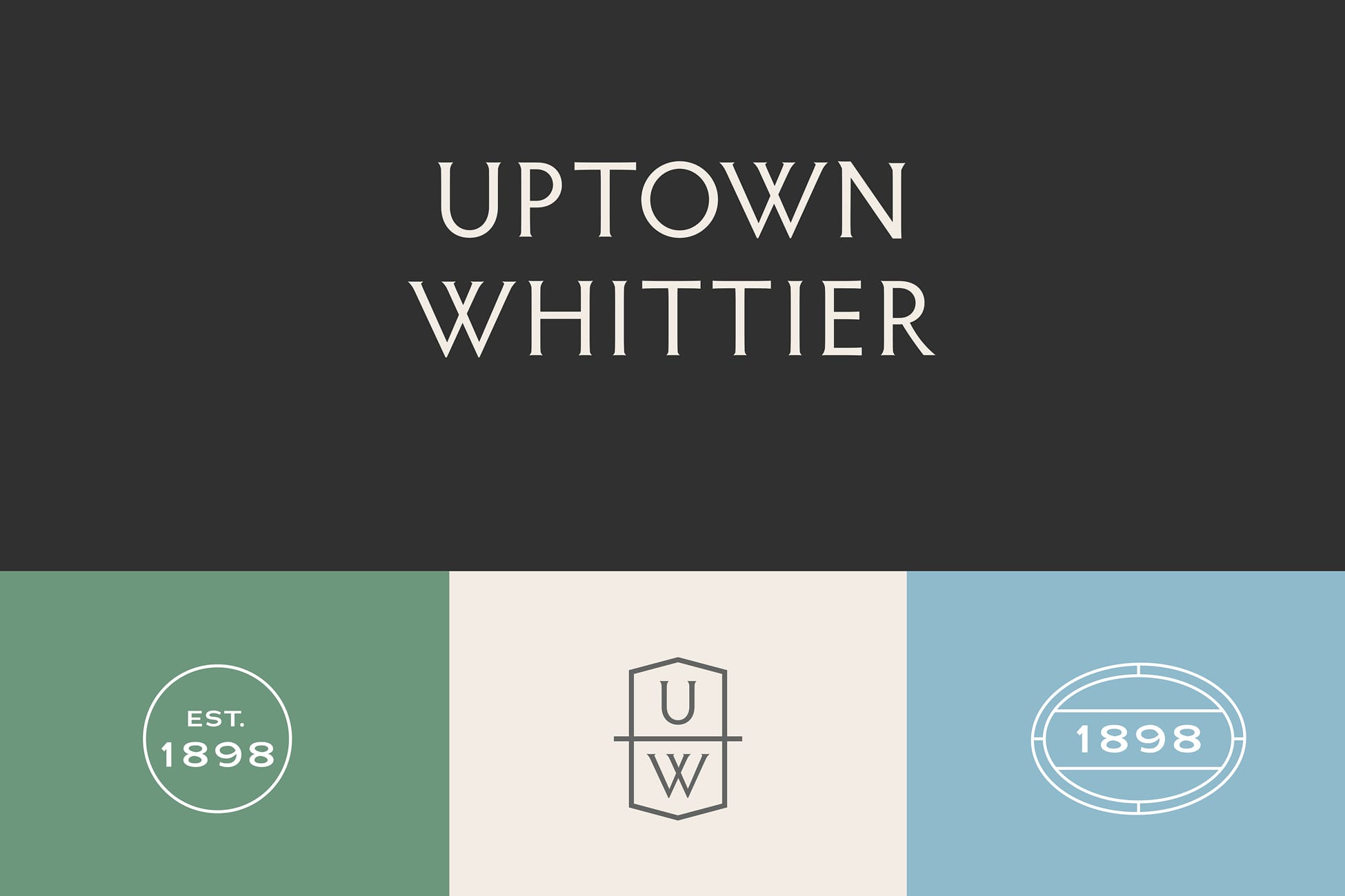
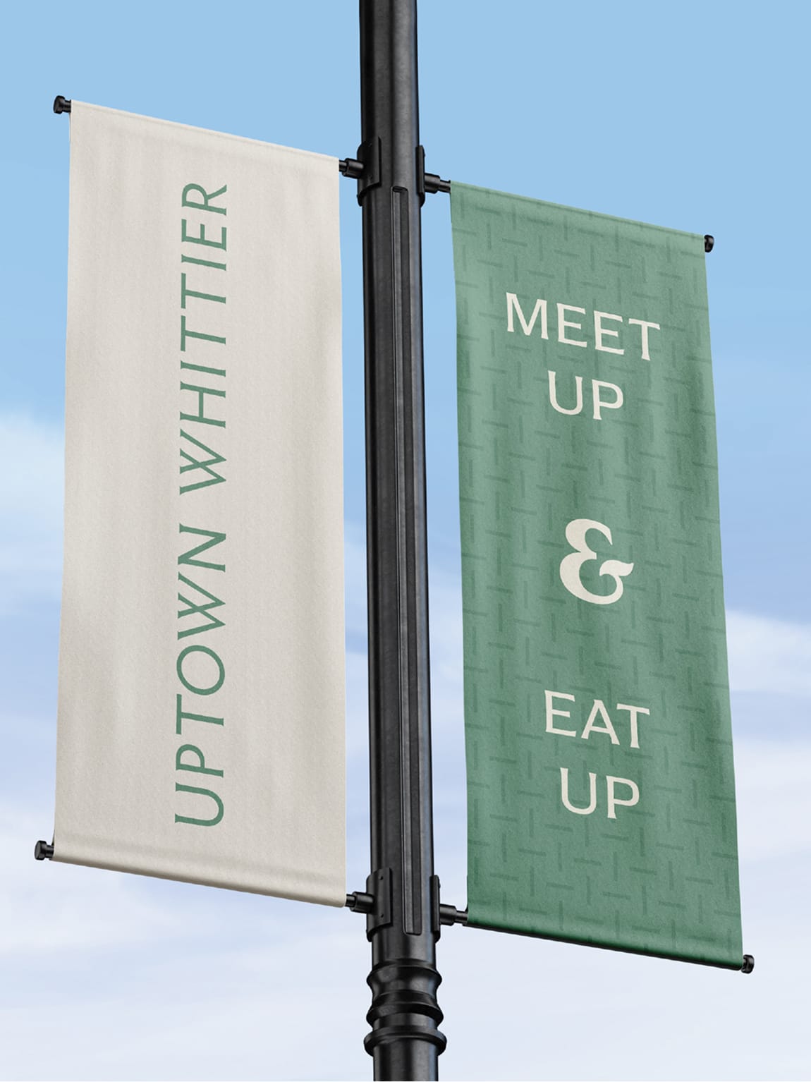
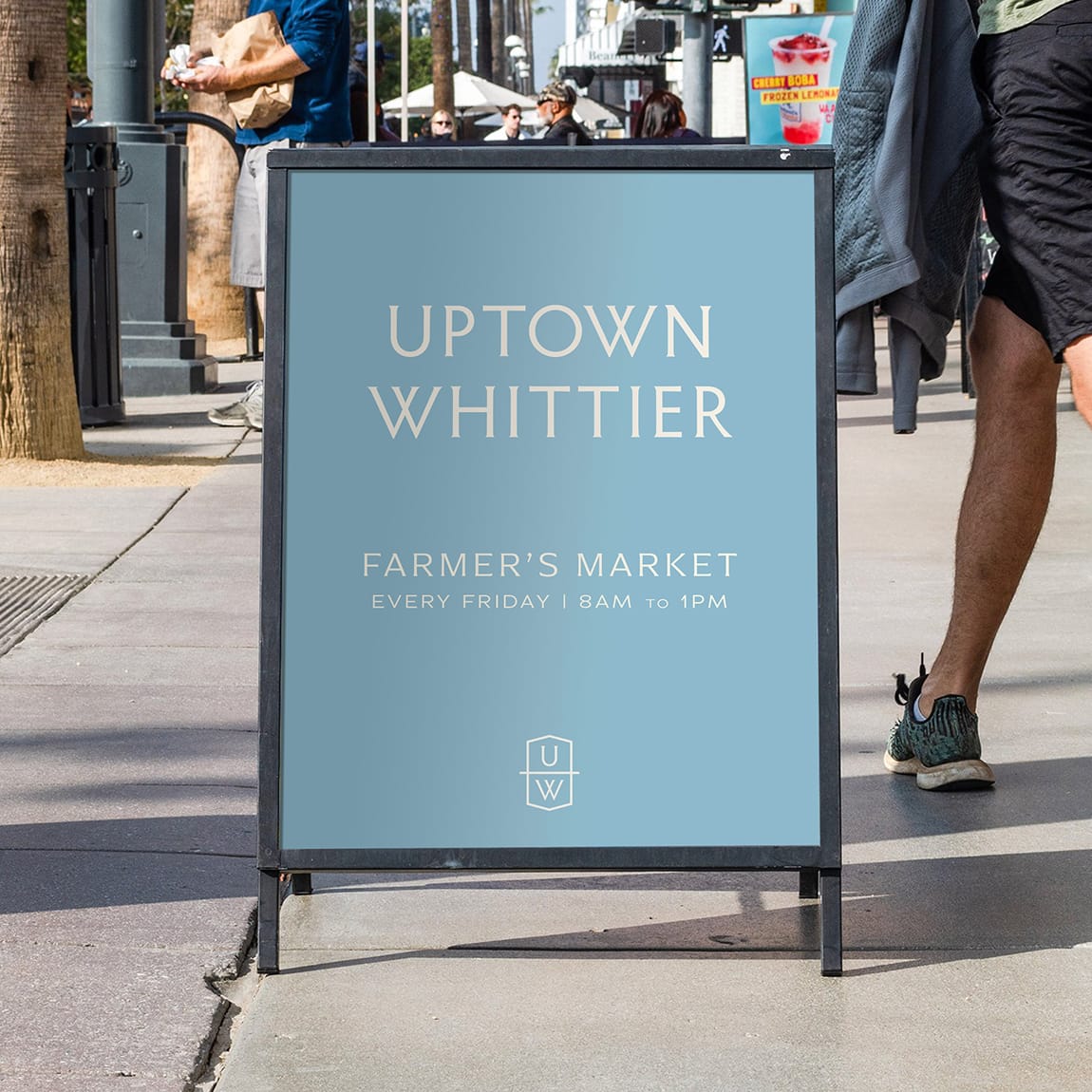
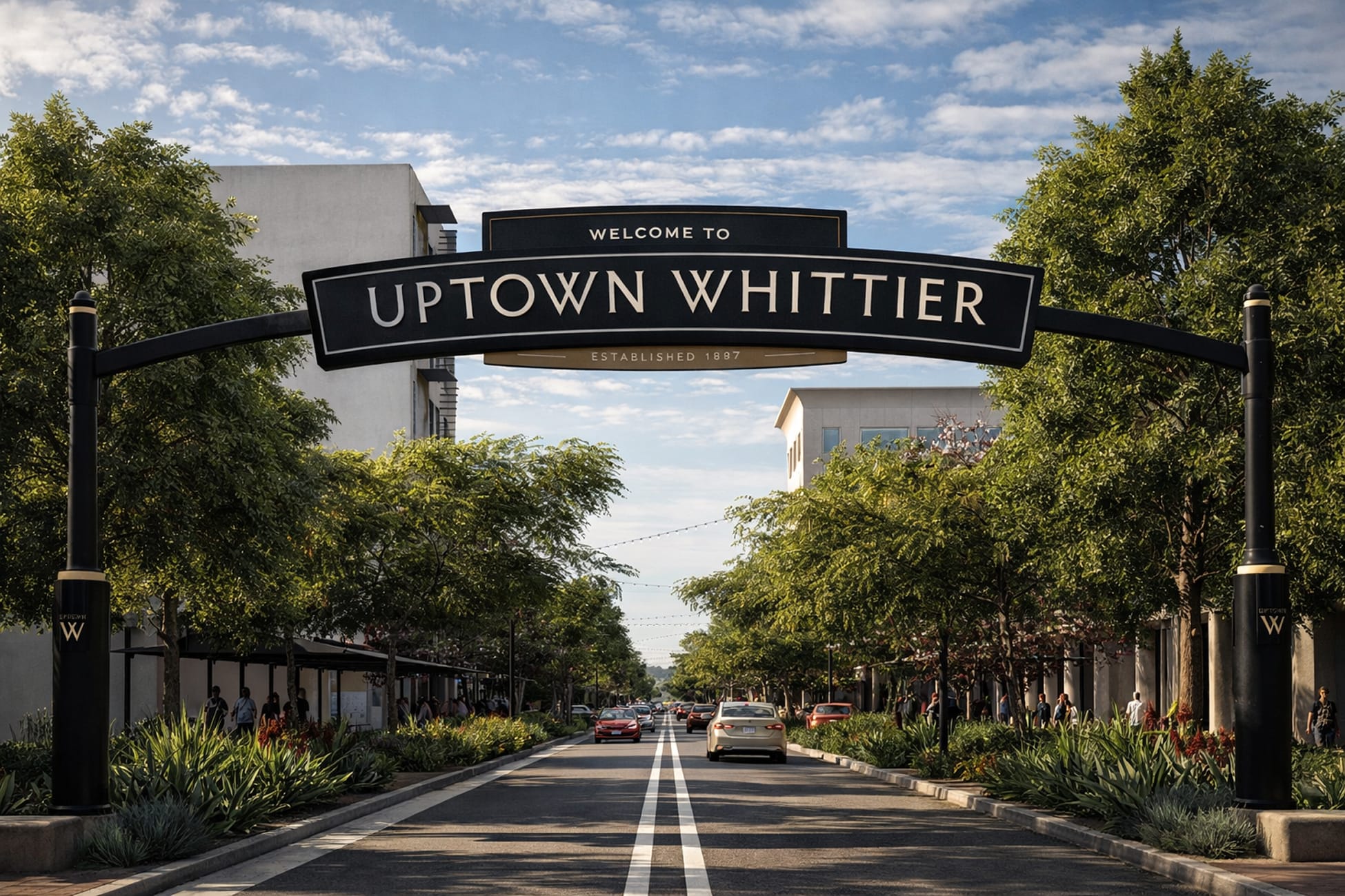
In the heart of Southern California, the City of Whittier was ready for a new chapter—one that would reflect the pride of its rich history and the promise of its future. RSM Design was invited to help write a refreshed brand story that would unite a diverse community under a shared identity. At the same time, the team also worked on Uptown Whittier, developing branding, environmental graphic design, and wayfinding signage that complement the city’s broader vision. Together, these parallel efforts created a cohesive visual and experiential framework that celebrates Whittier’s historic character while guiding its next era of growth. From the very beginning, the city made it clear: this brand needed to be shaped by the voices of its people. Through public workshops, meetings with City Council members, and conversations with the Mayor and staff, RSM Design gathered a rich mosaic of perspectives. To reflect a city as layered and as loved as Whittier, we first had to tune into the voices that shape it every day.
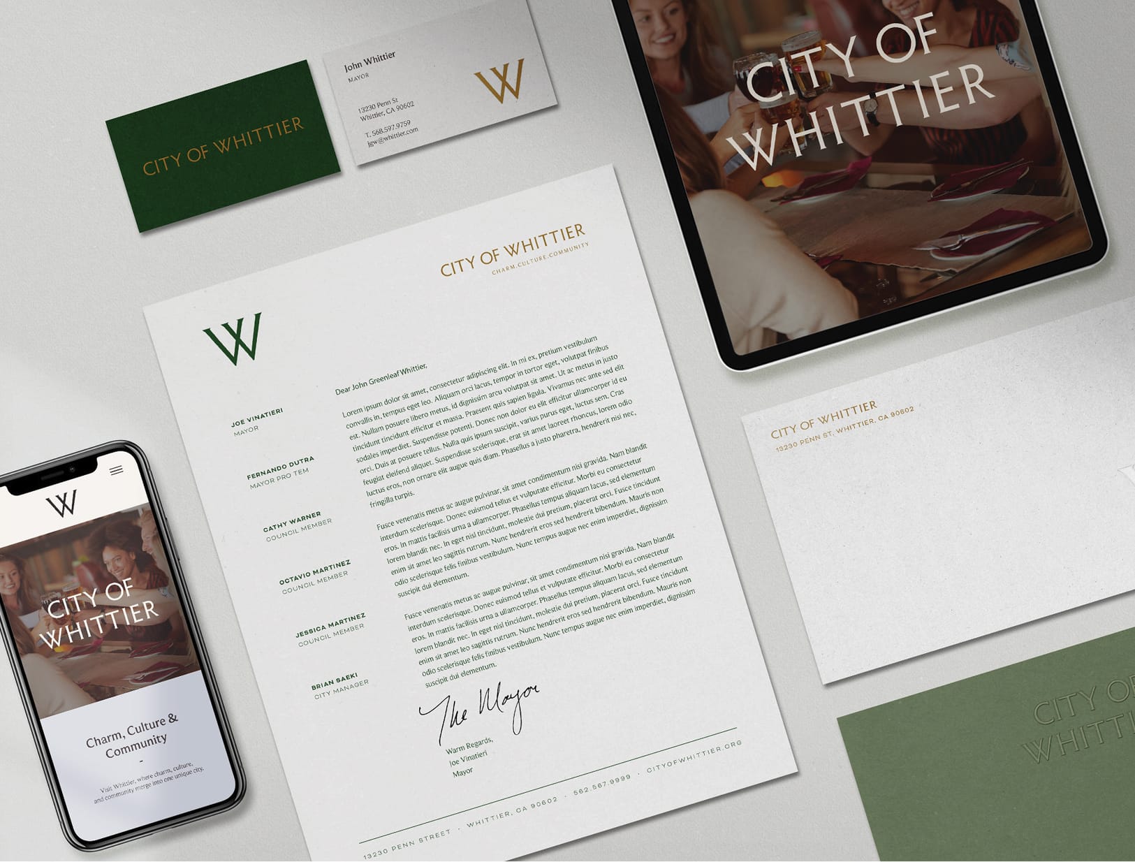
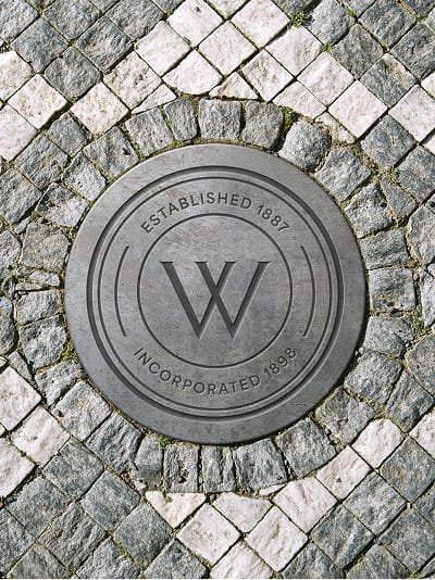
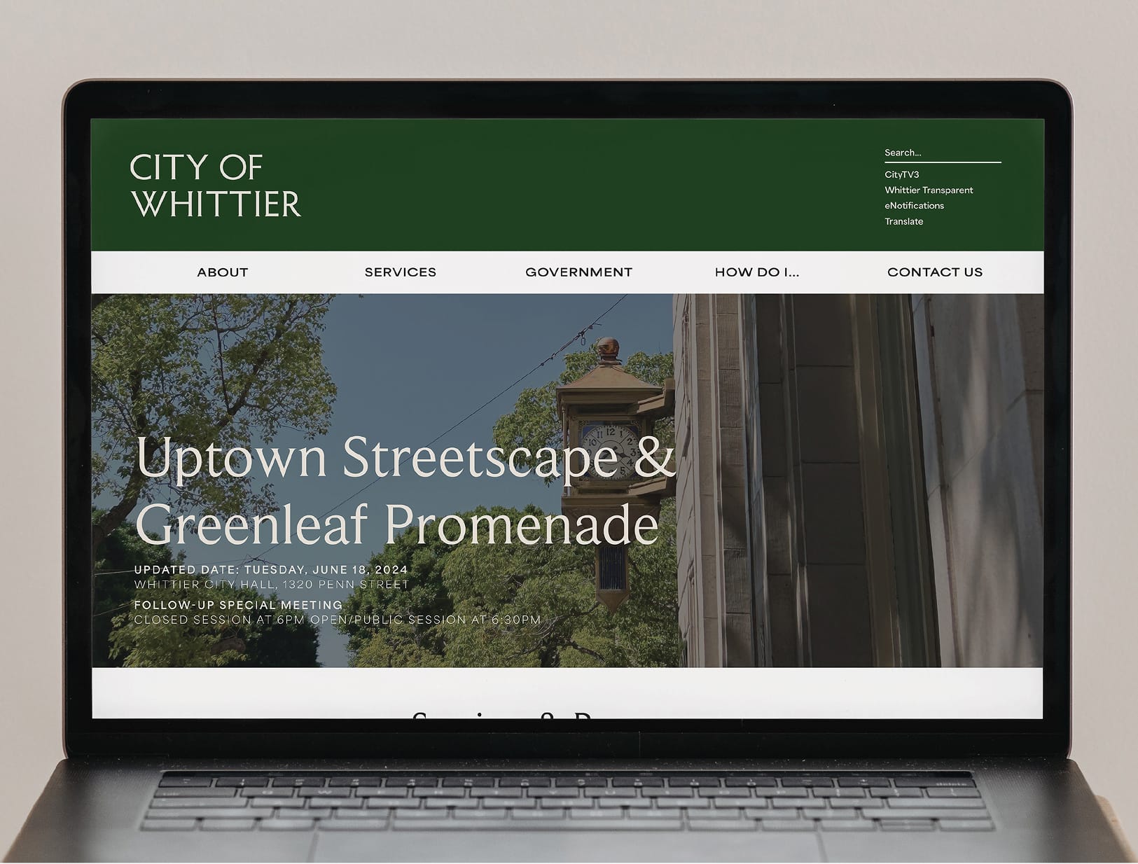
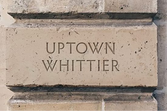
While walking along Whittier’s streets, we found subtle yet powerful nods to the past, from historic lettering to archives and familiar landmarks. These details became the foundation of a custom typography system that feels fresh yet familiar, evoking the generations that built the city while pointing toward what’s next. Guided by a clear brand mission to project Whittier as a safe, forward-looking, family-centered community, RSM Design crafted a visual language and voice that proudly reflect the city’s values: Honoring Heritage, Nurturing Community, Fostering Culture, and Empowering Engagement. The resulting identity is more than a logo or color palette—it’s a renewed sense of pride and belonging for Whittier. The logo itself blends typography inspired by the city’s historic architecture with letterforms drawn from poet John Greenleaf Whittier’s works, creating a brand deeply rooted in both heritage and literary legacy.

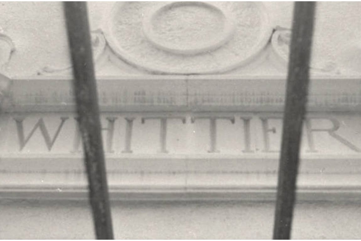

The logo blends typography inspired by the city’s historic architecture with type styles drawn from poet John Greenleaf Whittier’s works, creating a brand rooted in heritage and literary legacy.