Project info
Client The Jewish Federation
Developer Mathews Development Group
Architect Belzberg Architects
Photographer Josh Cho Photography
Design That Reflects Resilience
Client The Jewish Federation
Developer Mathews Development Group
Architect Belzberg Architects
Photographer Josh Cho Photography
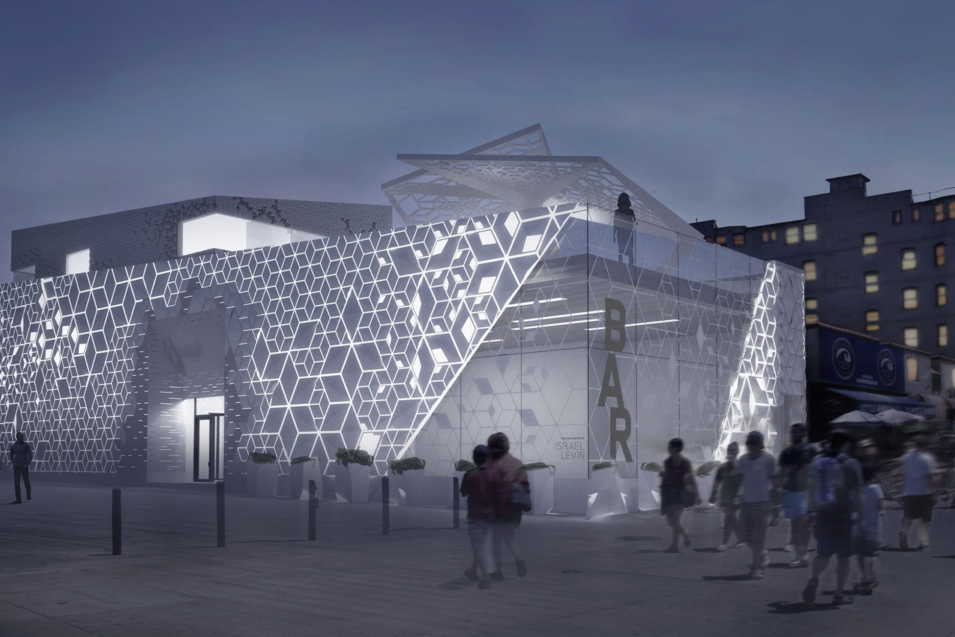
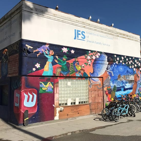
Perched just steps from the Pacific on Venice’s iconic Ocean Front Walk, The BAR Center at the Beach stands as both a welcoming community hub and a beacon of cultural presence for the Jewish community of Los Angeles. What began as a thoughtful renovation of a 1960s-era building evolved into an opportunity to weave meaning, memory, and identity into every surface — without ever overtly proclaiming them.
From the earliest conceptual stages, RSM Design joined the project in close partnership with the client and architectural team, grounded in a shared commitment to story-first design. The Jewish Federation expressed a clear ambition: the Center should feel open, hospitable, and integrated with its beachside context, yet it also needed to protect the privacy and dignity of the community it serves. Balancing these dual intentions shaped the narrative of the design itself.
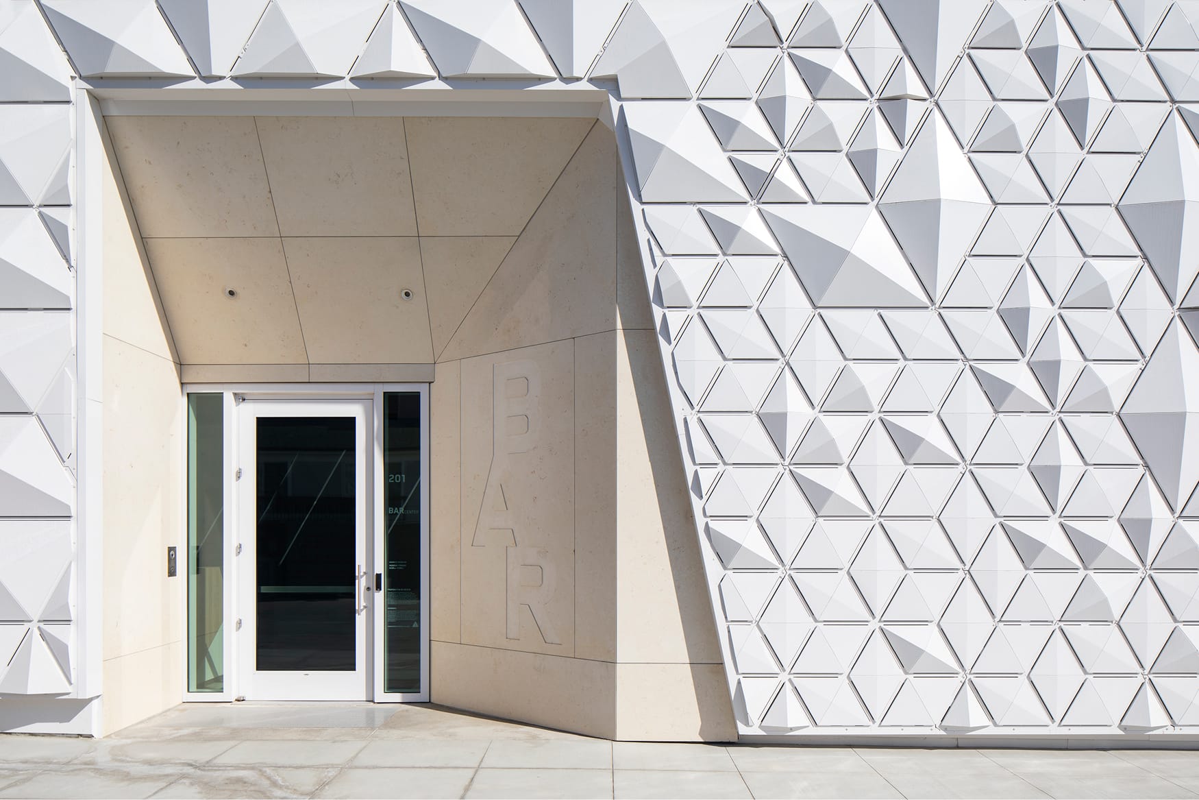
Central to the design strategy was the idea of “visible invisibility” — honoring centuries of resilience and cultural identity in ways that communicate quietly but powerfully. This concept informed the building’s skin, which is wrapped in a tessellated pattern abstracted from the Star of David. Rather than overt symbolism, the motif reveals itself gently and geometrically, creating layers of meaning that reward closer engagement.
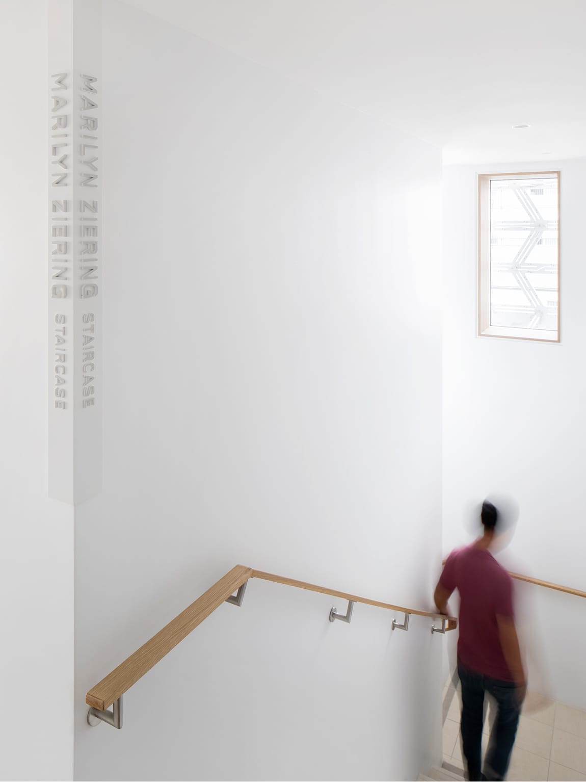
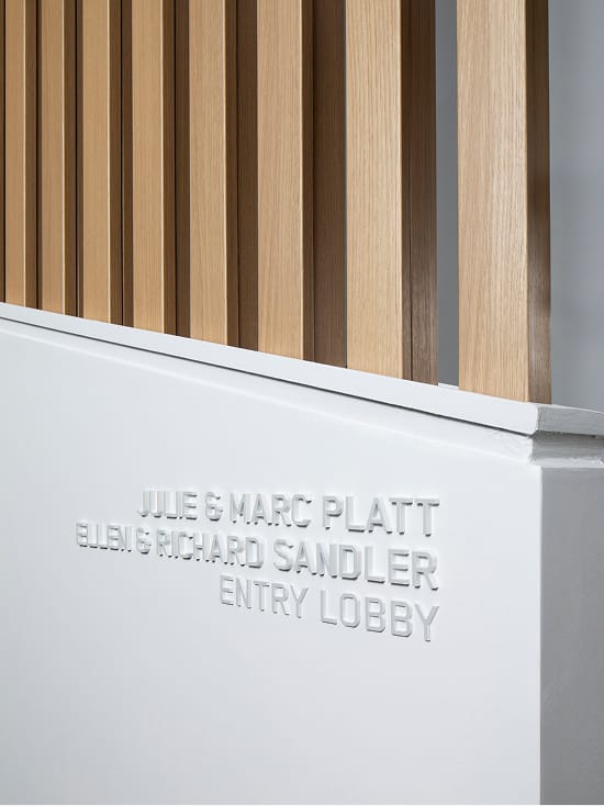
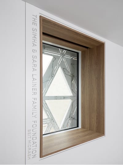
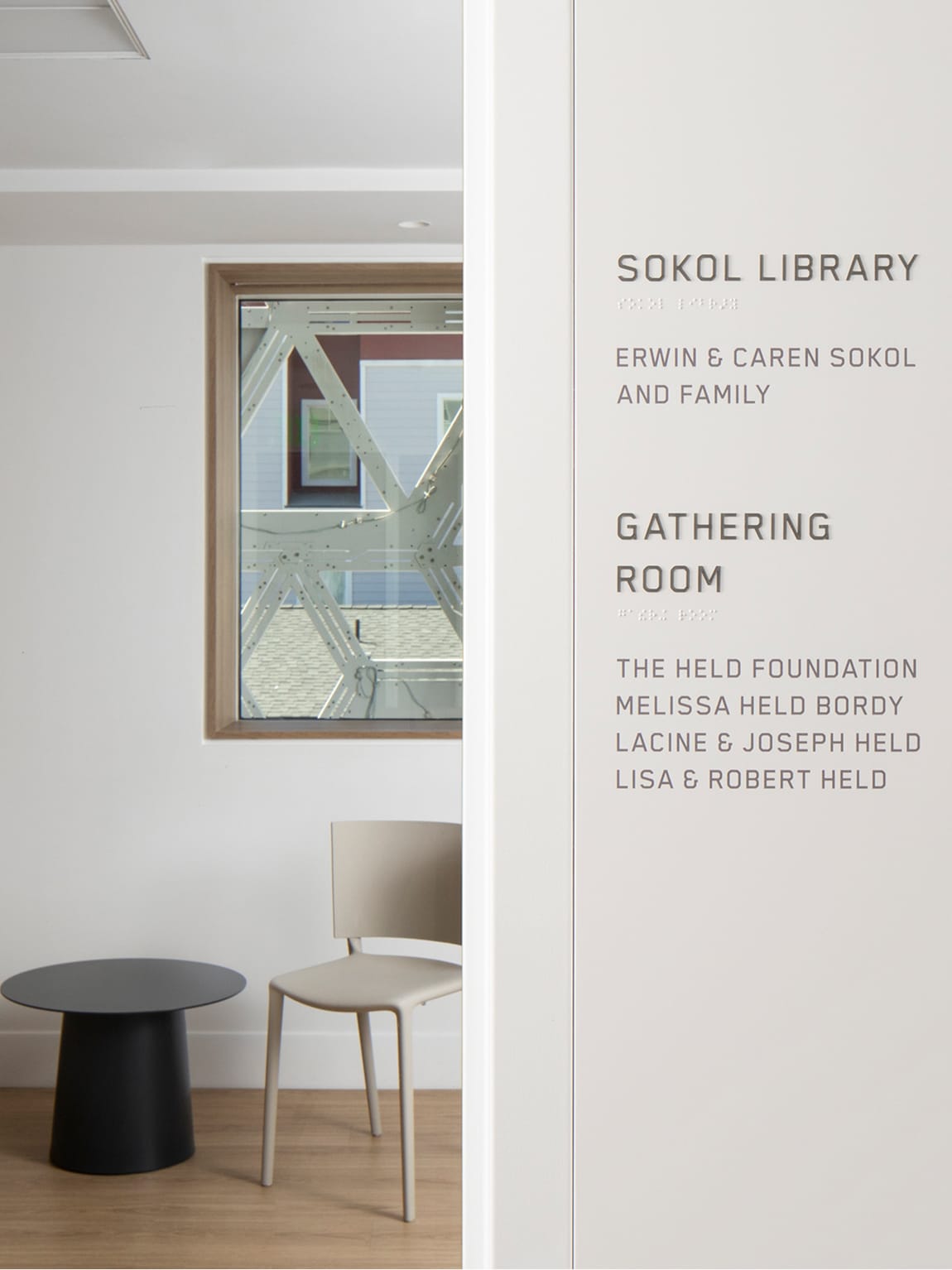
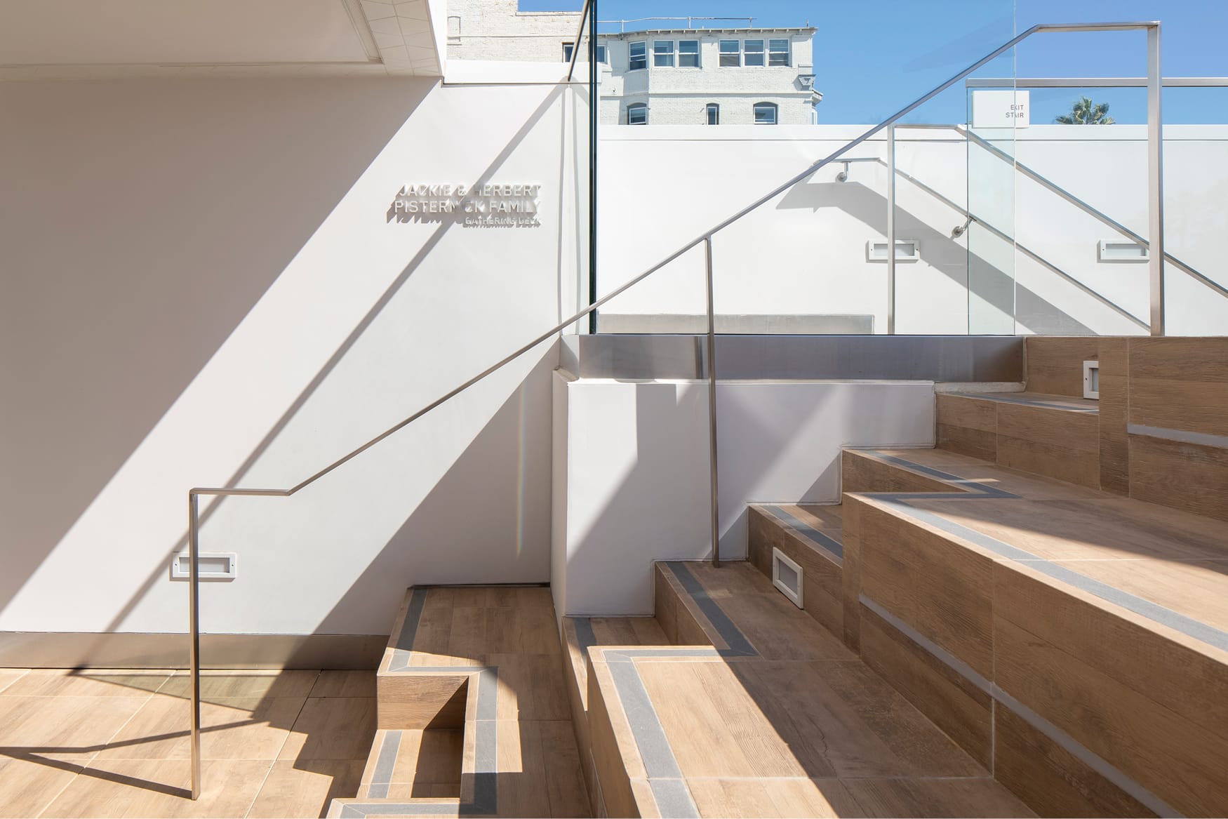
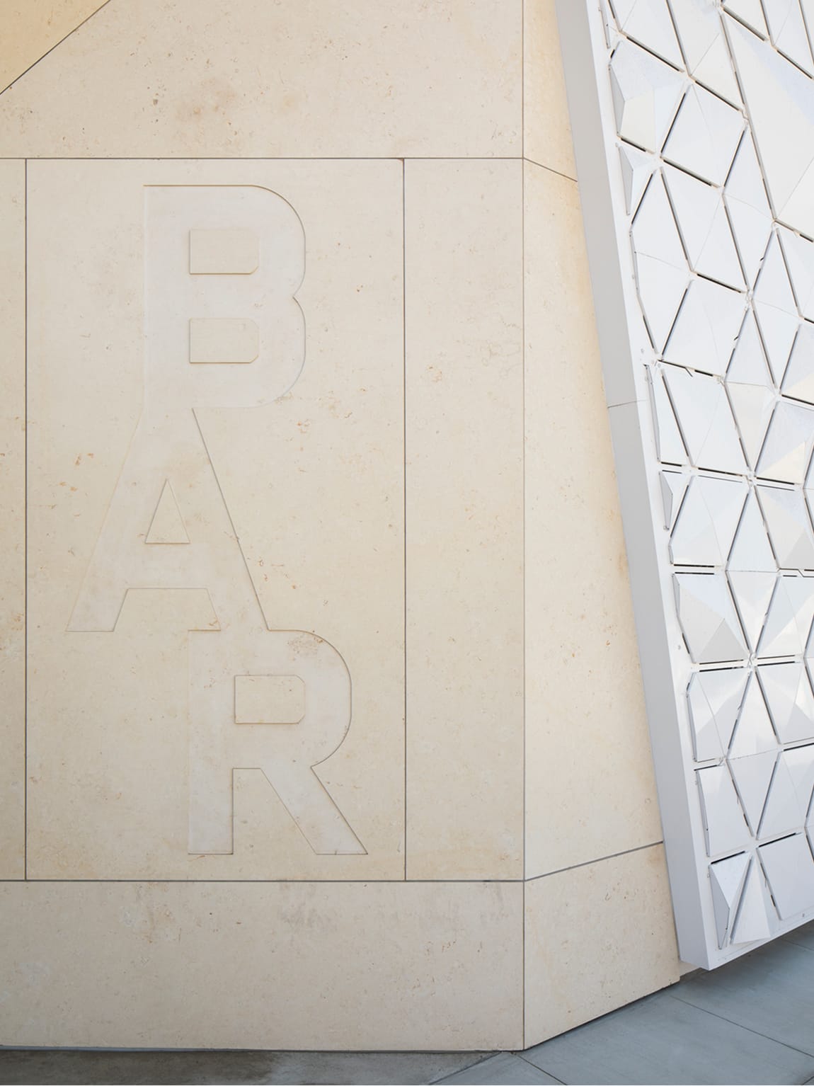
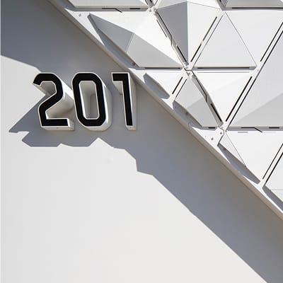
This ethos extended into the environmental graphics and wayfinding systems throughout the building. Exterior signage is etched into surfaces with deliberate permanence — from entrance identity carved in Jerusalem limestone to engraved wayfinding that respects both materiality and context. Inside, signage continues the restraint with white-on-white treatments that suggest clarity, sacredness, and connection without distraction.
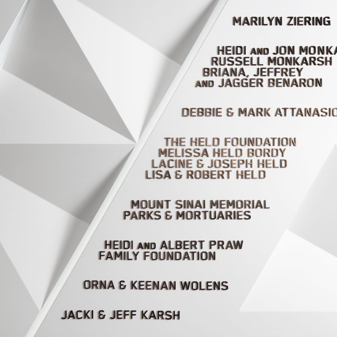
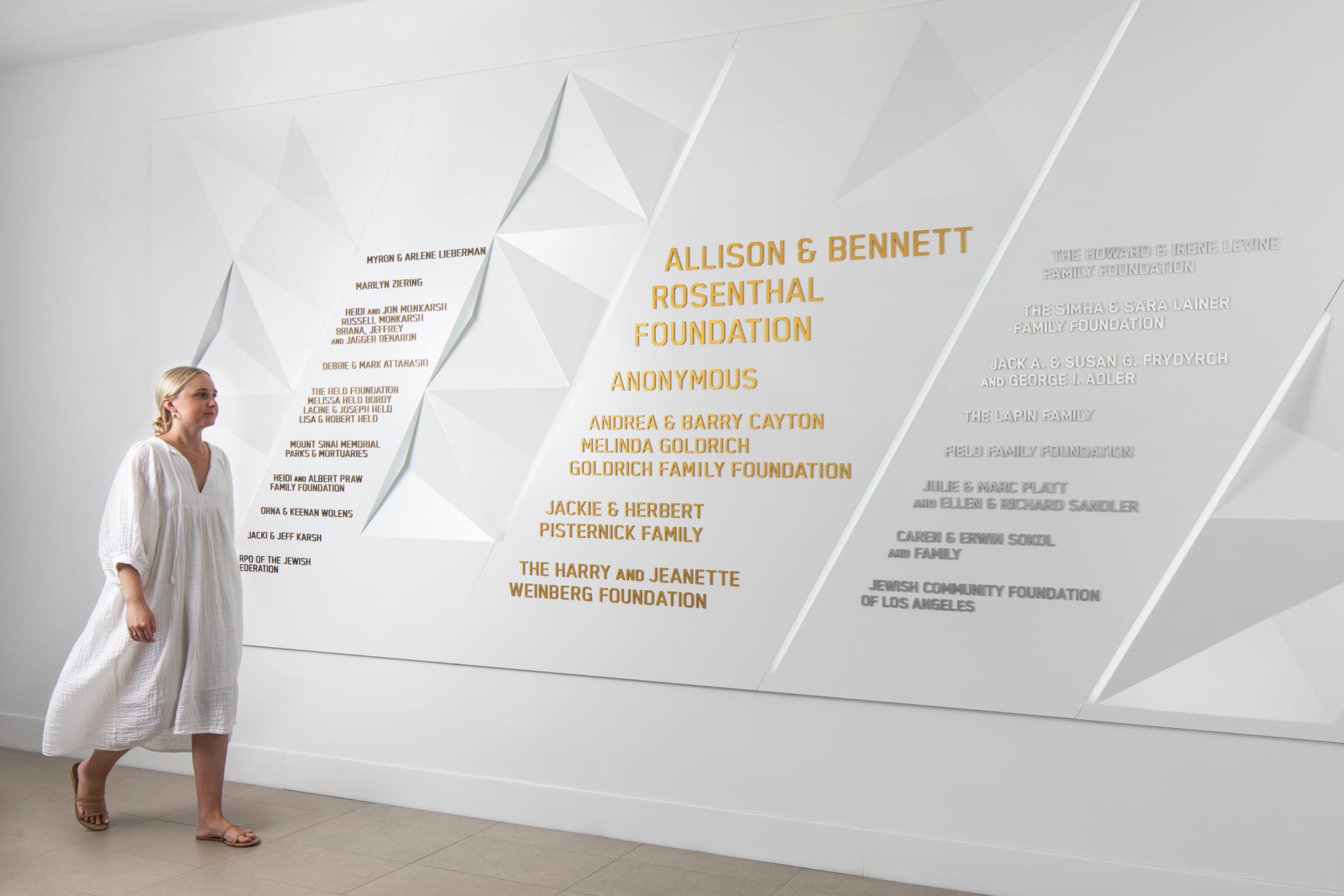
The environmental graphics system does more than direct; it reflects values. Donor recognition walls and curated identity elements honor those who support the Federation’s mission while engaging visitors with the deeper narrative of history and future aspirations. Through material choices, typographic decisions, and spatial awareness, the design bridges cultural significance with everyday experience.
This project exemplifies RSM Design’s broader philosophy of principle‑centered design: listening deeply, asking purposeful questions, and understanding the space and story before shaping its form. At The BAR Center at the Beach, every element — from façades to wayfinding — works silently yet meaningfully to connect people to place and heritage.
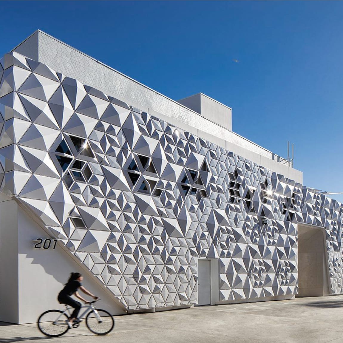
Image courtesy of architype.net
This limitation resulted in a one-of-a-kind outcome, born from collaboration, empathy, and asking good questions.